
PART 3: 10 steps to create clickworthy website content that converts
>> FREE DOWNLOAD <<
Grab your free Badass Homepage Copy Planner here!
Have you read Part 1 + Part 2 of this blog post series yet? If not, you can find part 1 here and part 2 here , then come back when you’re ready to move forward!
Part 1 covers:
Why it is so important to have a website (that *actually* converts)
The current trust recession we are operating in as business owners.
How to prepare a sturdy foundation of clarity from which you can build your website.
The first 3 steps to creating clickworthy website content that converts - planning out your UX journey, doing SEO keyword research and creating a badass brand identity.
Part 2 covers:
Steps 4-7 of creating clickworthy website content that converts - investing time/money/energy into your website’s visuals & copy including tips on sourcing quality visuals & how to write copy that sells.
Now that you’re up to speed, let’s jump into the next steps to creating, converting website content!
STEP 8: Use headlines and CTAs, on repeat!
Harsh truth: Only 80% of website visitors will only read the headlines - whutt?!
I know bummer riiight? But stick with me...
Most people assume that their website visitors will read all of their words (even the teeny tiny ones) so they don’t pay as much attention to the quality of their headlines and then they wonder why their website isn’t really converting.
However, if you EXPECT that the majority of people will only read your headings, then you will be able to approach your copy from a completely different angle and be able to optimise them for conversion.
ACTION STEP: Make sure all of the headings on your website (especially your homepage, services & sales pages) answer at least ONE of the following questions:
What do you do & who for?
What is the specific problem you solve?
How do you do it differently?
Here are Some examples from my current homepage: (may need to update this)
“Squarespace web design for online coaches & entrepreneurs.” (the what + who)
“Need a website? Need it to convert? Need it like yesterday?” (specific problem + how I’m different)
“BADASS CONTENT = MORE SALES.” (specific problem I solve)
“Build a website for your business that not only looks amazing but will *actually* sell your stuff.” (what I do)
“Take a peek into my highly-efficient design process.” (how I’m different)
Let’s move onto cta’s - your call-to-actions - and review some ways you can improve their conversion rate:
ACTION STEP: Make sure your CTA’s are:
Clear - Keep it short ‘n’ simple - don’t get creative here, eg: “Browse services”
Commanding - Tell your viewer what to do next eg: “Get freebie here.”
Contrasting - Make your CTA’s clickable buttons with a bold colour that stands out & make sure the text is readable.
Here are some other CTA recommendations for you to implement to increase your website’s conversion rate:
Add urgency when necessary - “Sign up now.”
Repeat the same CTA text on your pages - don’t worry about being repetitive - you need to be!
Place them above the fold (before viewer scrolls) - the 2 most highly converting spots are the top right in the nav bar and centre of first header).
Also place them under chunks of text as they scroll and whenever you want them to do something!
Using the word “GET” is known to be highly converting as well as using “MY” instead of “YOUR”, eg: “Get freebie here” / “Save my seat”
STEP 9: Collect & share social proof that actually sells
Having effective social proof for your viewers to read is vital for creating a website that converts. why?
Because your viewers won’t just take your word for it as you are the one selling them something. BUT they will believe someone else who doesn’t have an agenda.
Plus, there is something called “The Bandwagon Effect” which basically means people are more likely to jump on the bandwagon (buy your thing) when they can see others have already purchased and have been able to create results.
There are some different kinds of social proof such as:
Trusted by - List of big names that you may have worked with, displaying their logos.
Virality - Using words like “bestseller,” “most popular”, “most requested.”
Case Studies - using data from previous client projects to show proof that you can generate results for your clients.
As seen in - List of logos of the media outlets you have been featured in or podcasts you’ve been on which helps establish your authority/expert status
Testimonials - Reviews from your previous clients who share the results they achieved through working with you.
Here is what an ineffective testimonial look like on a website…

But if you want testimonials that will actually do the hard selling work for you, then you will need to format them more effectively so that they actually get read...
ACTION STEP: Apply these rules to create more effective testimonials:
Break up testimonial text blocks with scannable headings, and different sized fonts. (Pull out the best part of testimonial and display in large heading first).
Make it look like a testimonial by using quotation marks and use italicised copy or a different font to the rest of your copy so it stands out.
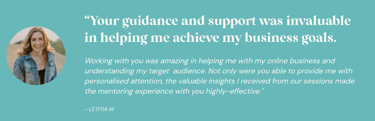
Make it sound more personal like an email or a DM by using 2nd person POV (“you”) and not 3rd person. EG: “Working with you was amazing!”
Add an image of your client with permission (increases conversion by 30%!)
When you can, use screenshots as they are more believable.
Here’s the same testimonial block reformatted using these rules I’ve just shared - can you see the difference?
STEP 10: Minimise user-friction at all costs.
I think I’ve said this already but I’ll say it again (cuz it’s very important!!) - your website should be an easy and enjoyable place for your viewer to hang out.
And if it isn’t? Yep you guessed it - they’re gonna bounce at speed like a tennis ball flying over the stadium fence (& never to be seen again!).
So it is essential that you are aiming to minimise as much friction as possible for your viewer so that they have a good experience on your website.
And by friction I am referring to anything that causes your viewer overwhelm, confusion or frustration. Otherwise, they are NOT going to hang around - there are plenty more websites for them to peruse on the world wide web.
One of the most common sources of user friction is the formatting of text on a website. (or a lack of!)
Let’s take a look at some common text ERRORS that I see all the time on websites and how you can FIX them on your own website:
ERROR: Having WAYYYY too much text (often without using headings) which only overwhelms your viewer. No one has time to read a novel, especially lots of really small text...
FIX: Be sure to use scannable headings to break up blocks of text (as we’ve already discussed). On your homepage, go for smaller blurbs of 130 words max rather than large paragraphs.
***
ERROR: Font size is too small or unreadable font styles making it really hard for your viewer to read.
FIX: Use a minimum font size of 16-18 pixels. Have a range of font’s you use but no more than 3-4 different font styles (ideally 3). I’d recommend having a:
bolder H1 font for large headings
signature brand font for H2 & H3 (you’ll use this the most)
either a lighter & smaller version of the H1 font for your H4 headline (great for eyebrow headlines) and/or a script font that pairs with your other fonts.
And of course a body font for your main text that pairs well with your heading fonts.
PS: Here are the fonts that I use in my own website branding as an example:
(screenshot)
PS: Limit to no more than 3-4 different font styles
***
ERROR: Centre aligning & justifying big chunks of text which makes it really hard for the viewer to read.
FIX: Best practice suggests that larger paragraphs of text should be left aligned and not justified. Since our eyes naturally read from left to right, this supports our eyeballs and means we have to work less hard to read the text.
A rule of thumb is to basically left-align everything including buttons. It is OK to centre-align short headings or very small chunks of text (1-2 sentences). If you centre the text, then centre the CTA button. Keep it consistent.
***
Another huge source of user friction is broken links - gah!!
ERROR: We have probably all had an experience on a website where we discovered a broken link, or we clicked on a button & it didn’t take us to the page we expected to land on.
The result? Epic frustration and an immediate BOUNCE! (Seeeee ya Felicia!)
FIX: Check and double-check your links and also make sure your forms are correctly linked to your mailing list etc. This is something that should be done on a regularish basis especially if you have a blog and have a lot of external links. Things change on the internet pretty regularly, so developing a habit of checking links on a quarterly/six-monthly basis would be worthwhile.
>>> FREE DOWNLOAD <<<
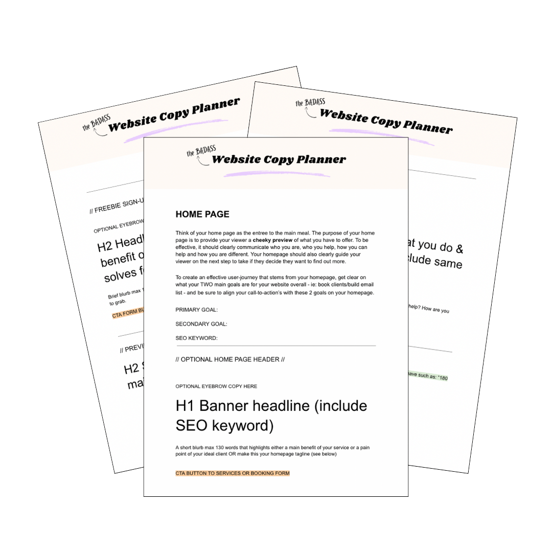
Grab your free Badass Homepage Copy Planner here!
Writing copy (that *actually* converts) for your website can be a super hard and overwhelming task that can keep you stuck & spinning your wheels for a loooong ass time!
I learned this lesson the hard way, but luckily for you - you don’t have to!
Download the Badass Homepage Copy Planner to strategically plan the copy for one of the most important pages of your website: your homepage!