
About the project
The Brief:
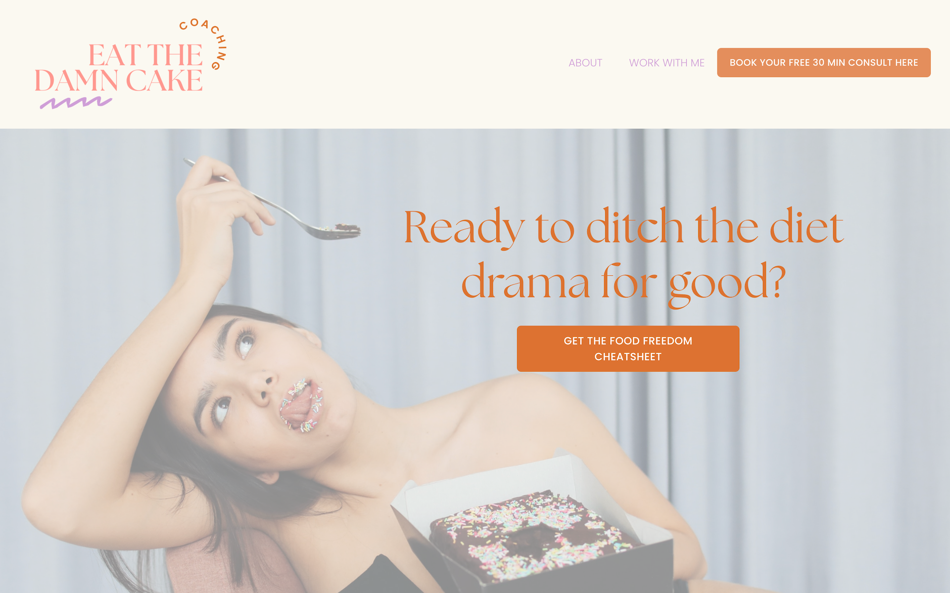
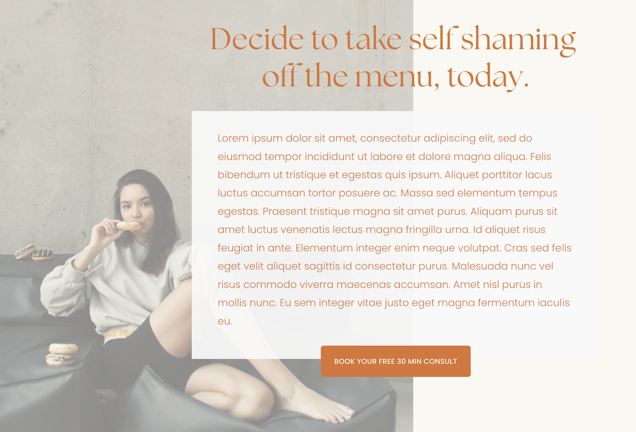
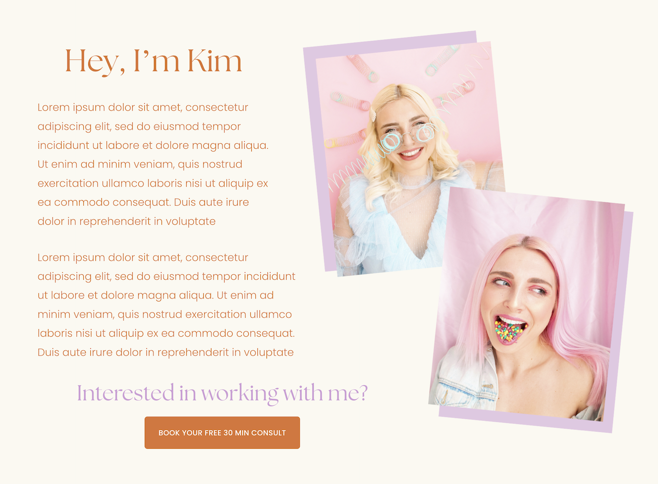
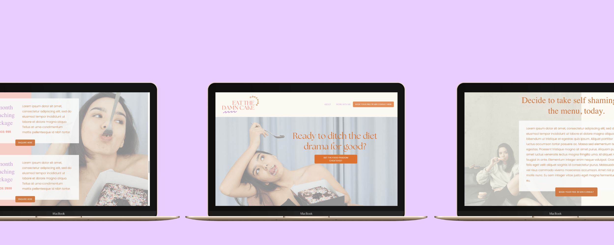
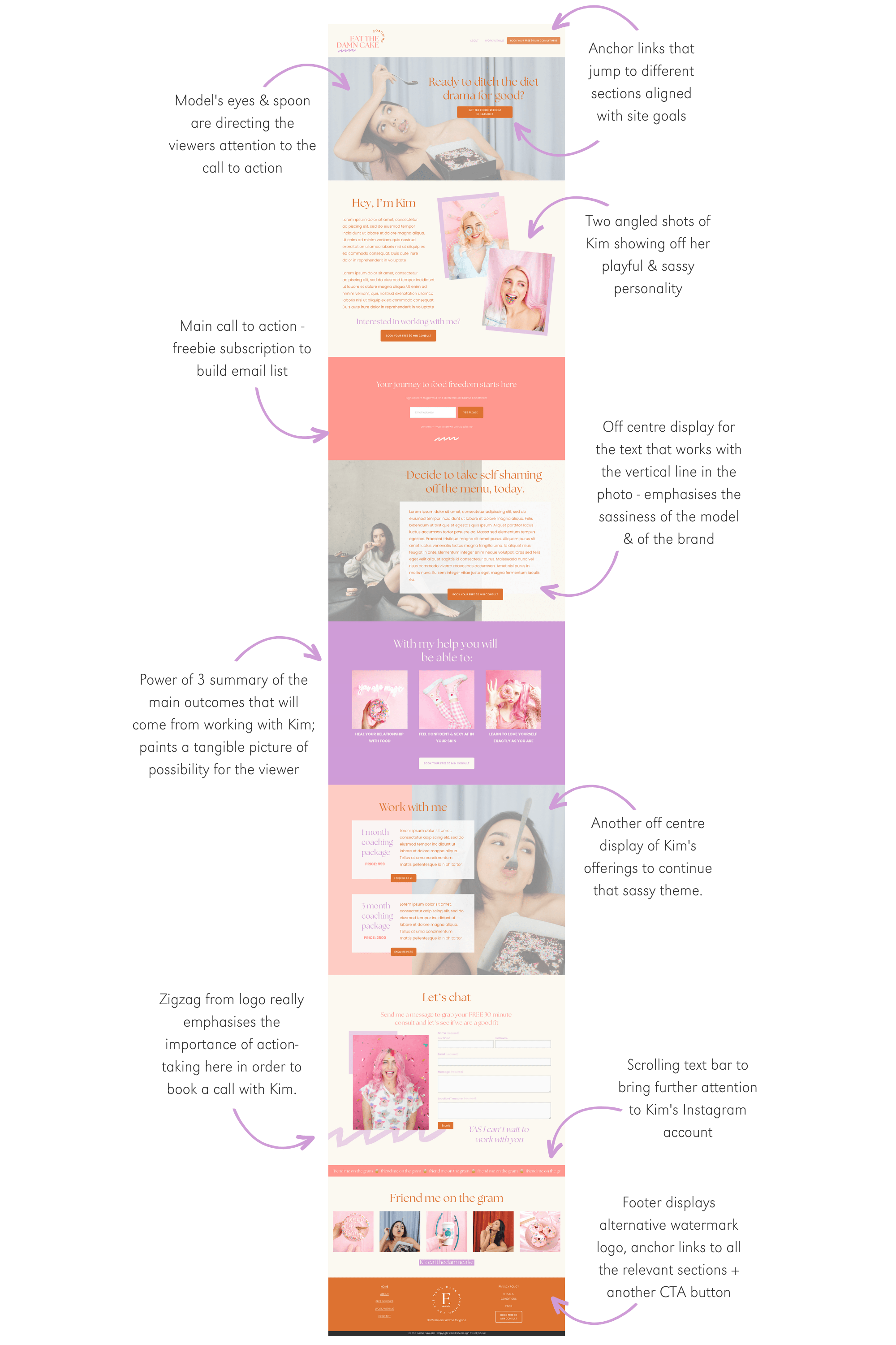
Kim is a new coach who specialises in helping modern women ditch the diet culture conditioning for good so that they can embrace an empowered relationship with both food and their bodies! After doing a bunch of free client work, she is finally ready to have a simple one-page website that reflects her expertise, as well as her sassy & fun personality.
Site Goals:
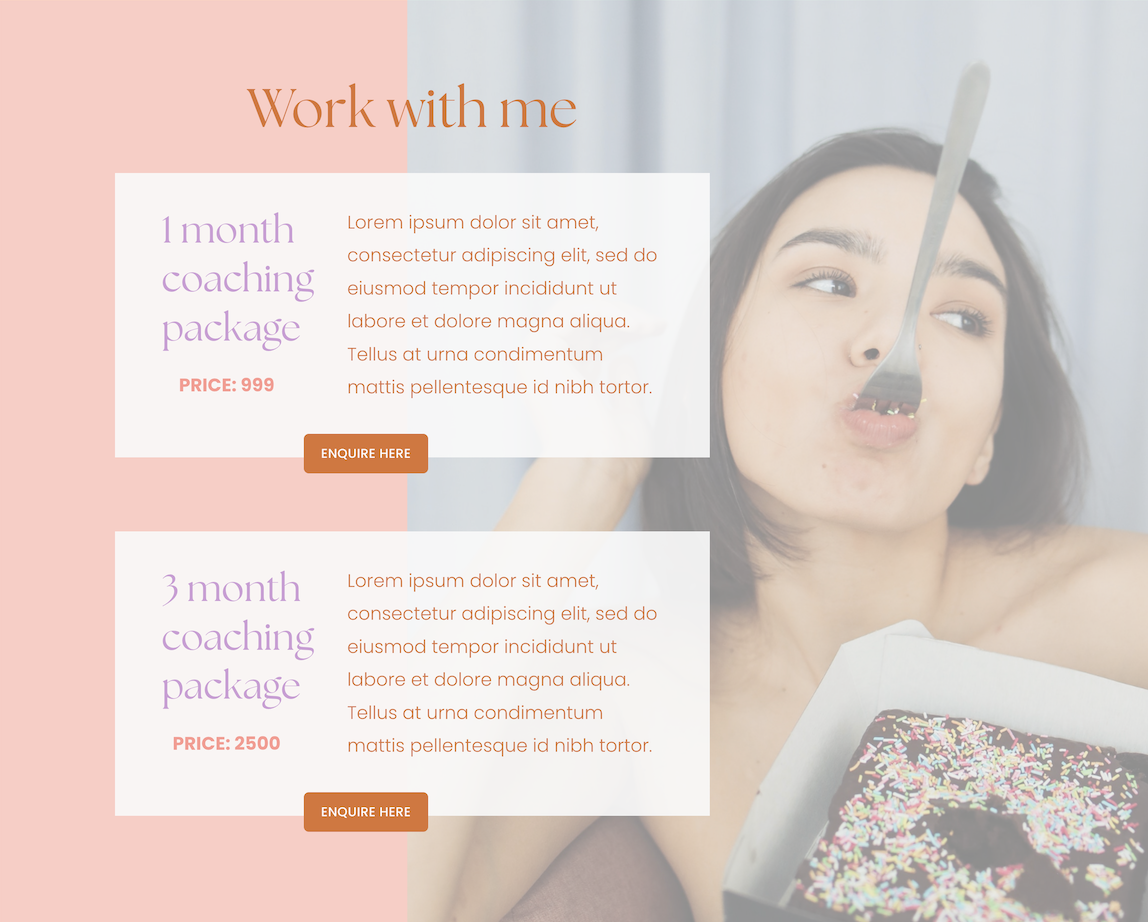
To sell her services/provide a place for clients to enquire about coaching & book free consult calls
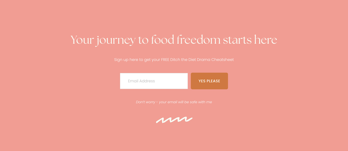
To start building her email list.
Branding
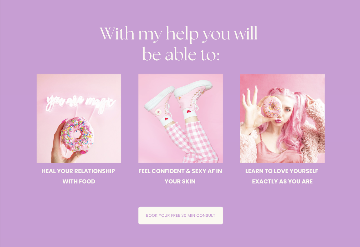
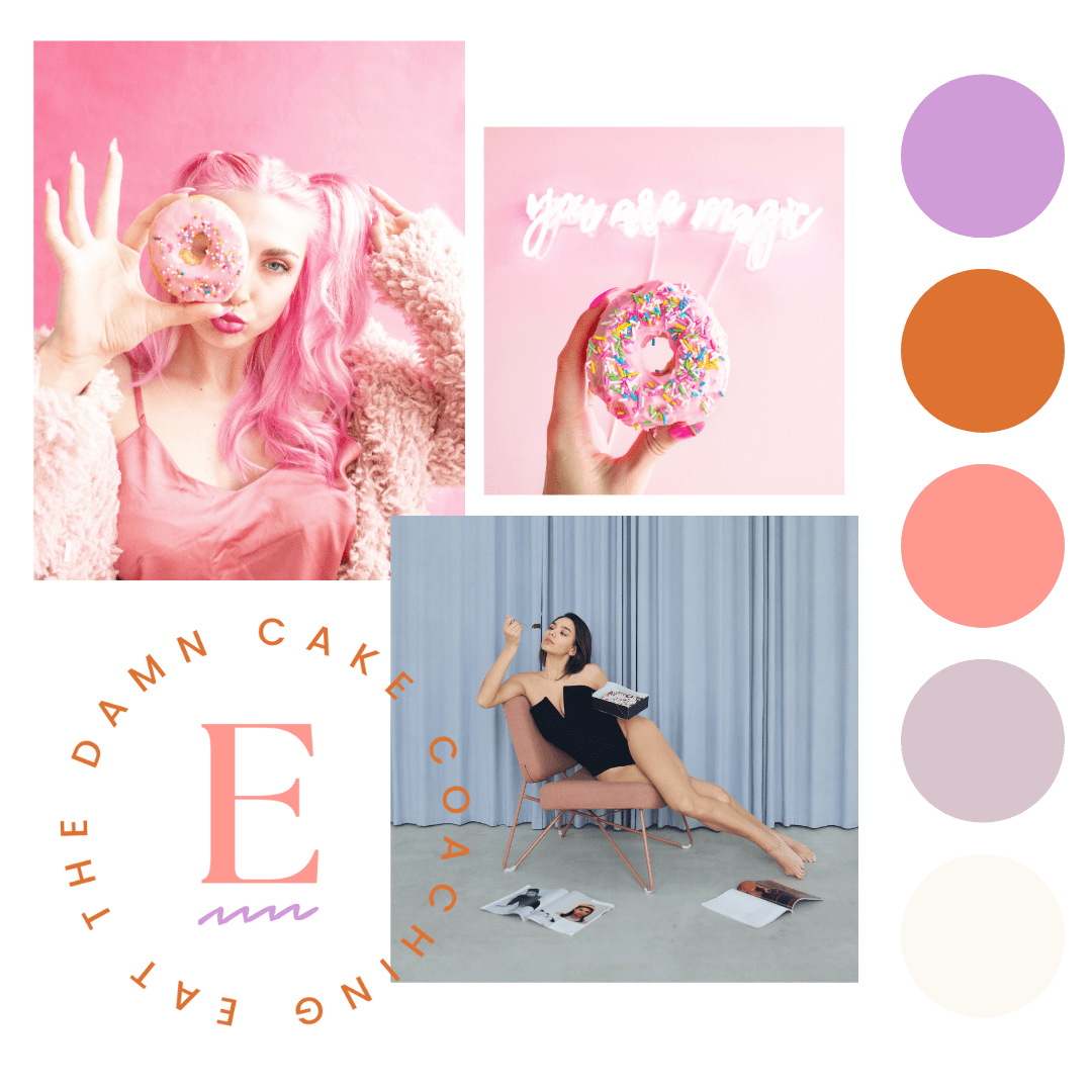
Values: self-love; joy; feeling sexy & empowered in your own skin; personal growth; fresh perspectives
Brand Words: modern; sassy; empowered
Design Translation:
Modern serif font - The Seasons - paired with sans serif font - Poppins.
Surprising colour palette combo and off-centre/overlapping design style emphasise Kim’s fun & sassy personality and coaching style.
Bold, contrasting colours, zigzag graphic combined with strong clickable call-to-actions communicate an empowered vibe to Kim’s prospective clients.
Web Design Elements
Take a closer look