RML BIZ OPS - OPERATIONS MANAGER
THE ULTIMATE GLOW-UP + copywriting add on

About the project
The Brief:
Reagen came to me in need of a complete brand & website makeover/personality-injection for her online business management business. She had done her best to DIY her old Squarespace website, but ultimately it wasn’t working for her any longer. As Reagen describes: “It was outdated, clunky, and not enough for someone whose literal job is helping other businesses run better.” Reagen was feeling uncertain about how to best package & display her large array of services in a way that wasn’t overwhelming for her viewers.
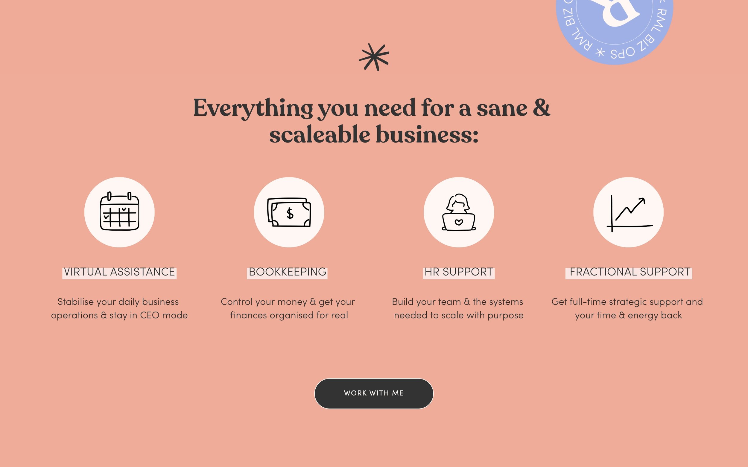
Site goals:
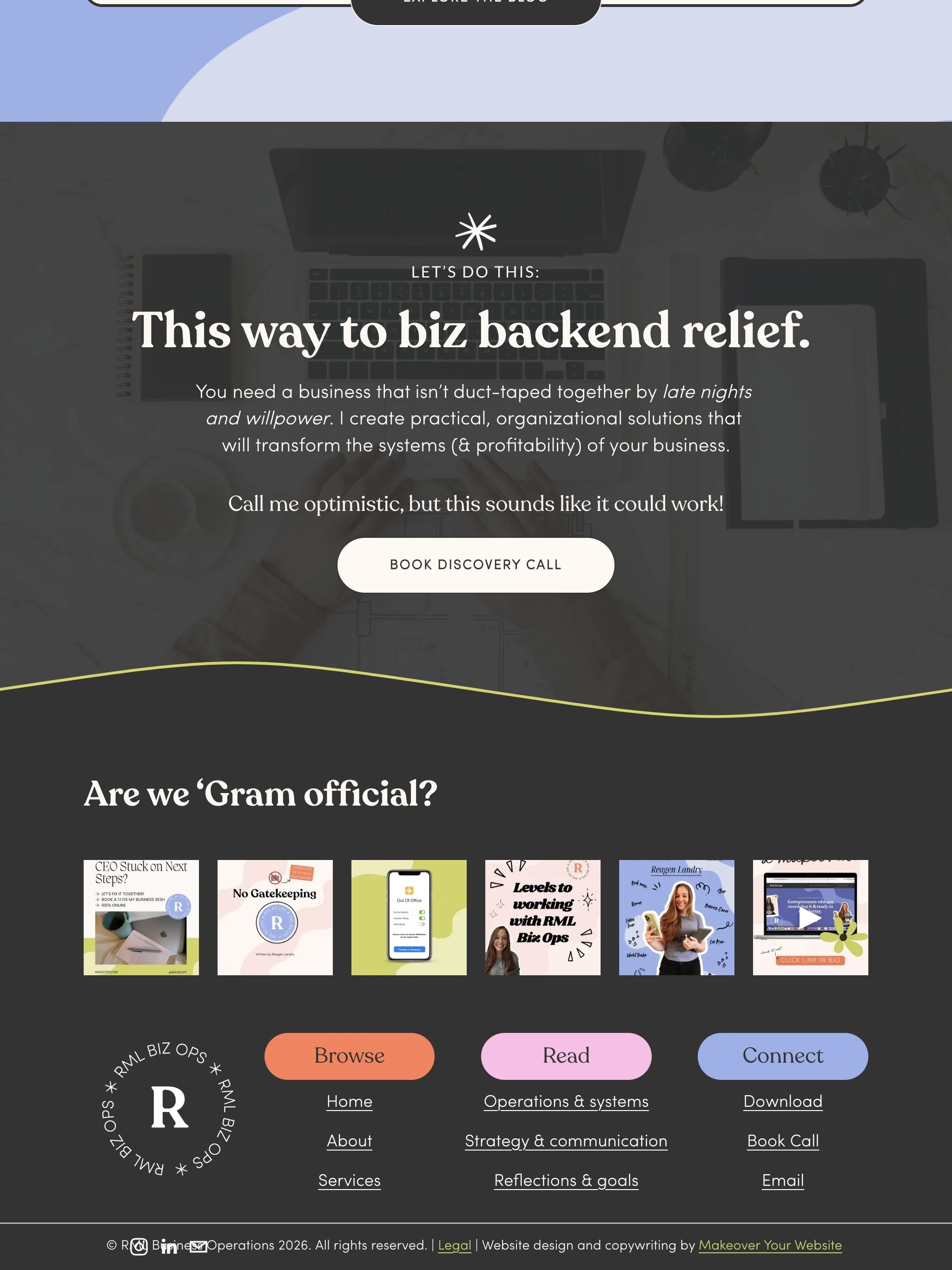
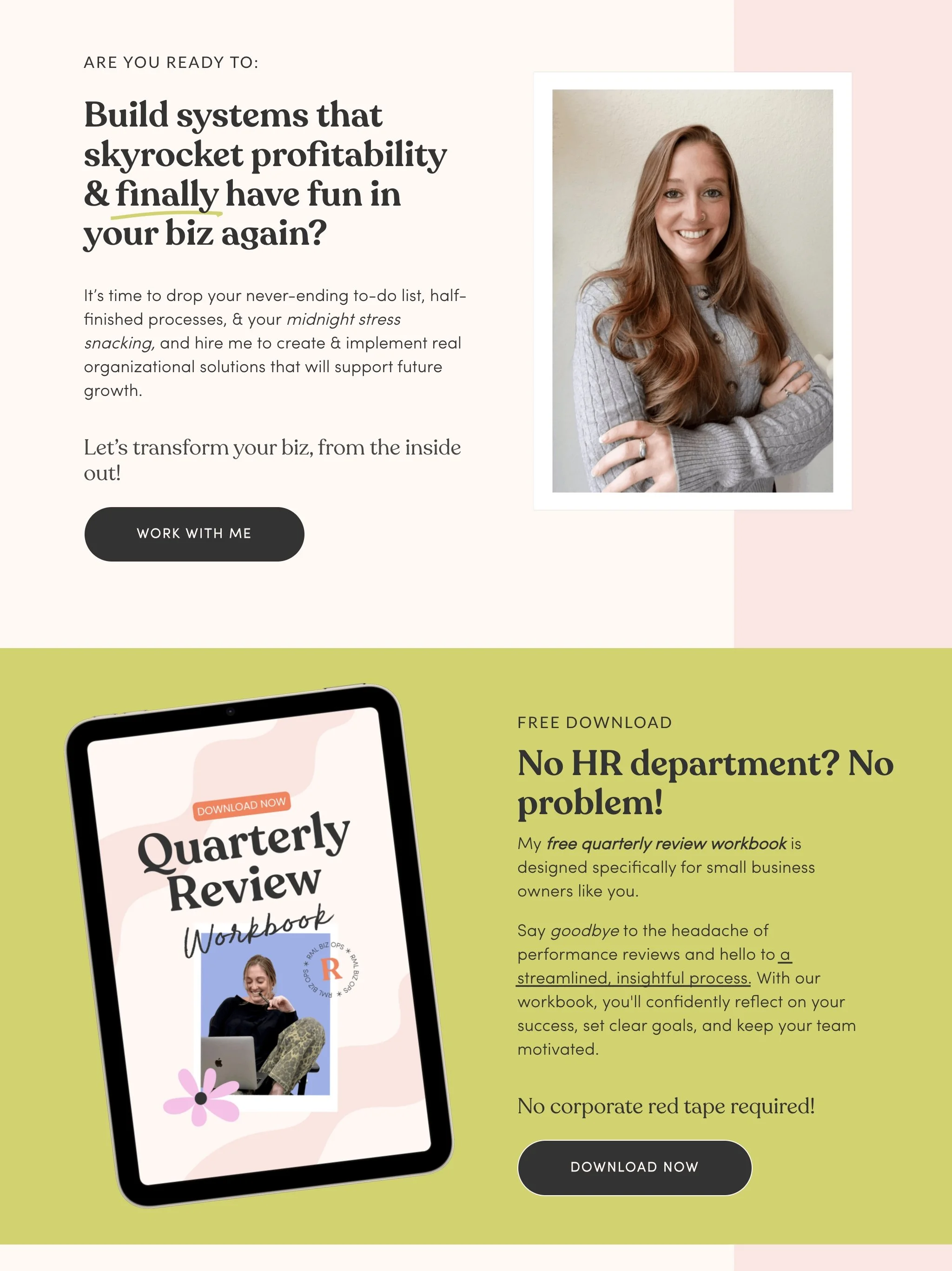
To book more consult calls with her ideal clients & sell her OBM services.
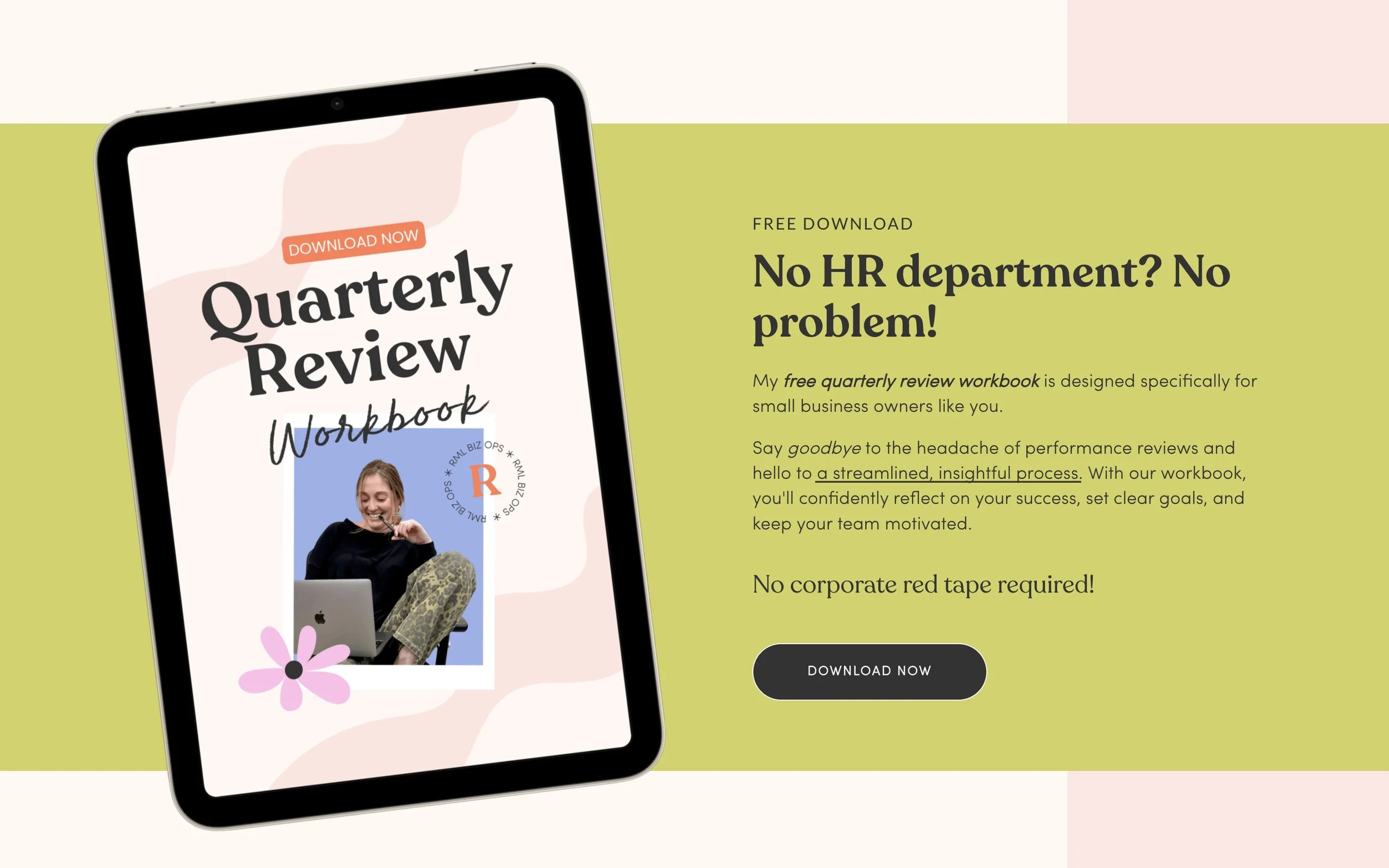
To build her email list subscriber base via her free download.
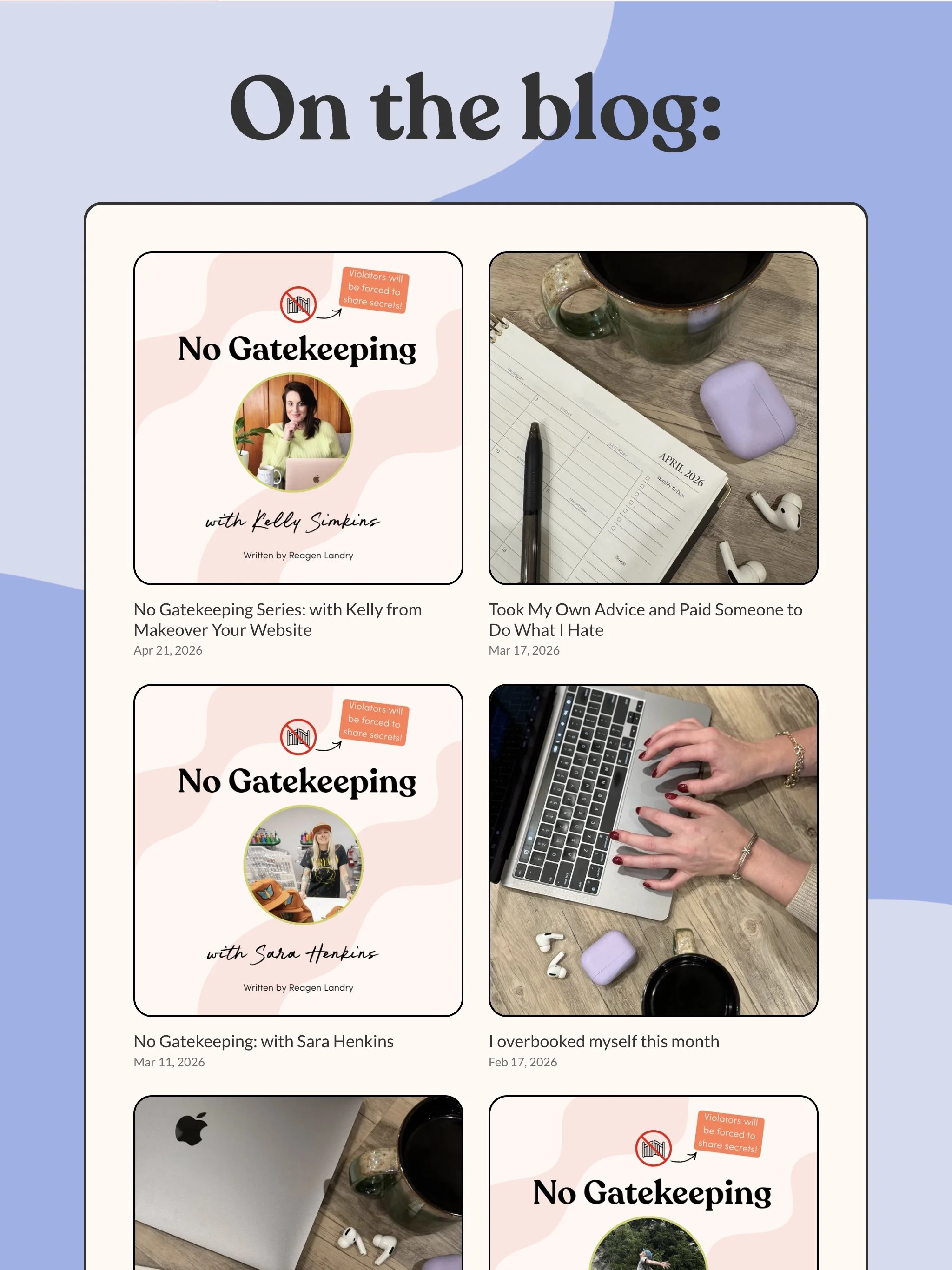
To increase organic traffic via her regular blog posts.
The Before:
Before working with me, Reagen had a DIY Squarespace website that wasn’t cutting the mustard. At best it was a (boring) brochure that displayed her services, and it lacked a lot of essential elements that makes a website effective such as: brand clarity, intentionally crafted sales copy, and scroll-stopping visuals.
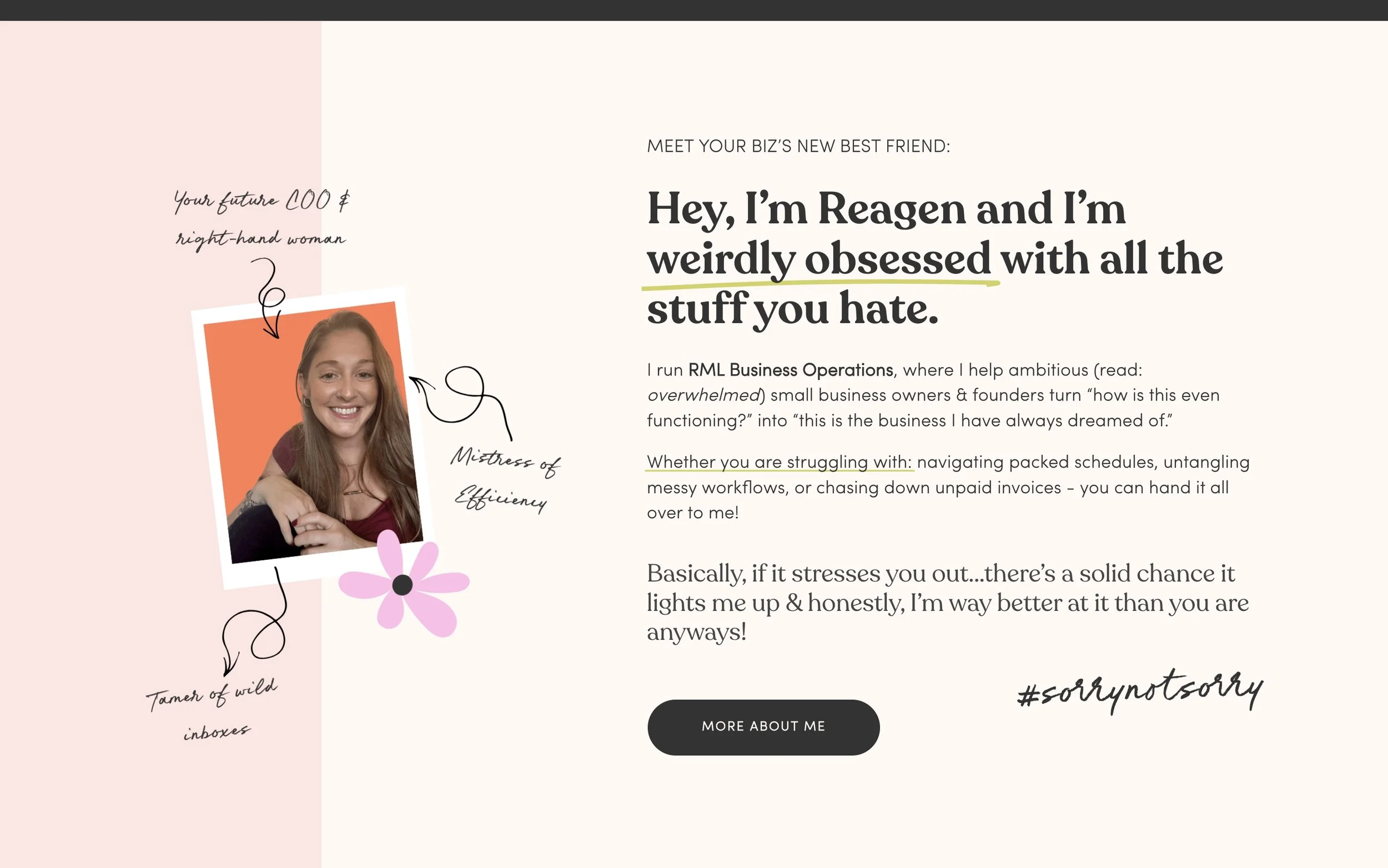
Brand Strategy:
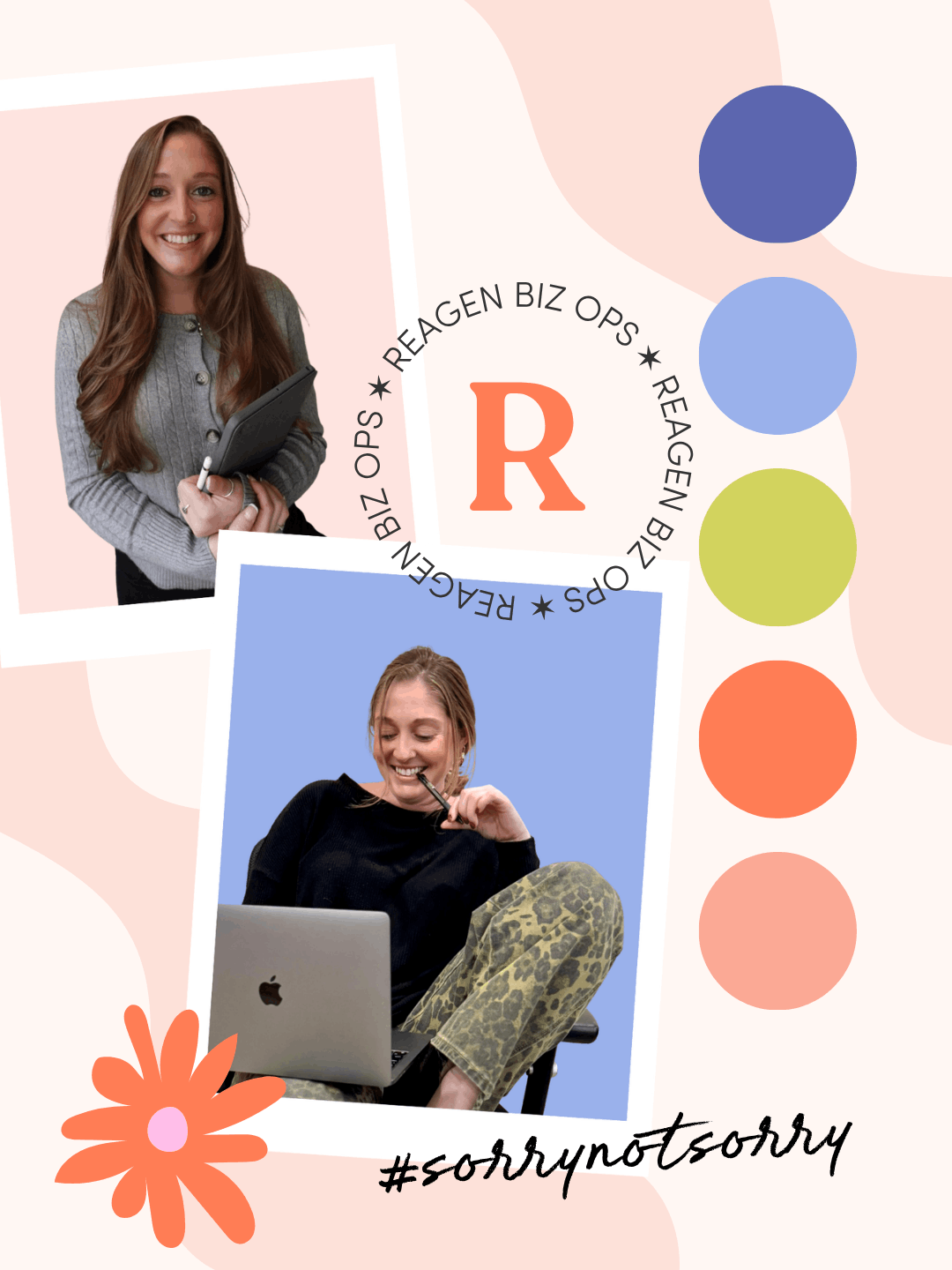
Values:
Efficiency, fun, collaboration, problem solving & honesty.
Brand words:
Energetic - excited, motivated, cares equally about the mission/purpose/goals of the businesses.
Thorough - attention to the details that small biz owner’s don’t even notice.
Genuine - trust worthy, pure intentions & truth in the work being done.
Design Translation:
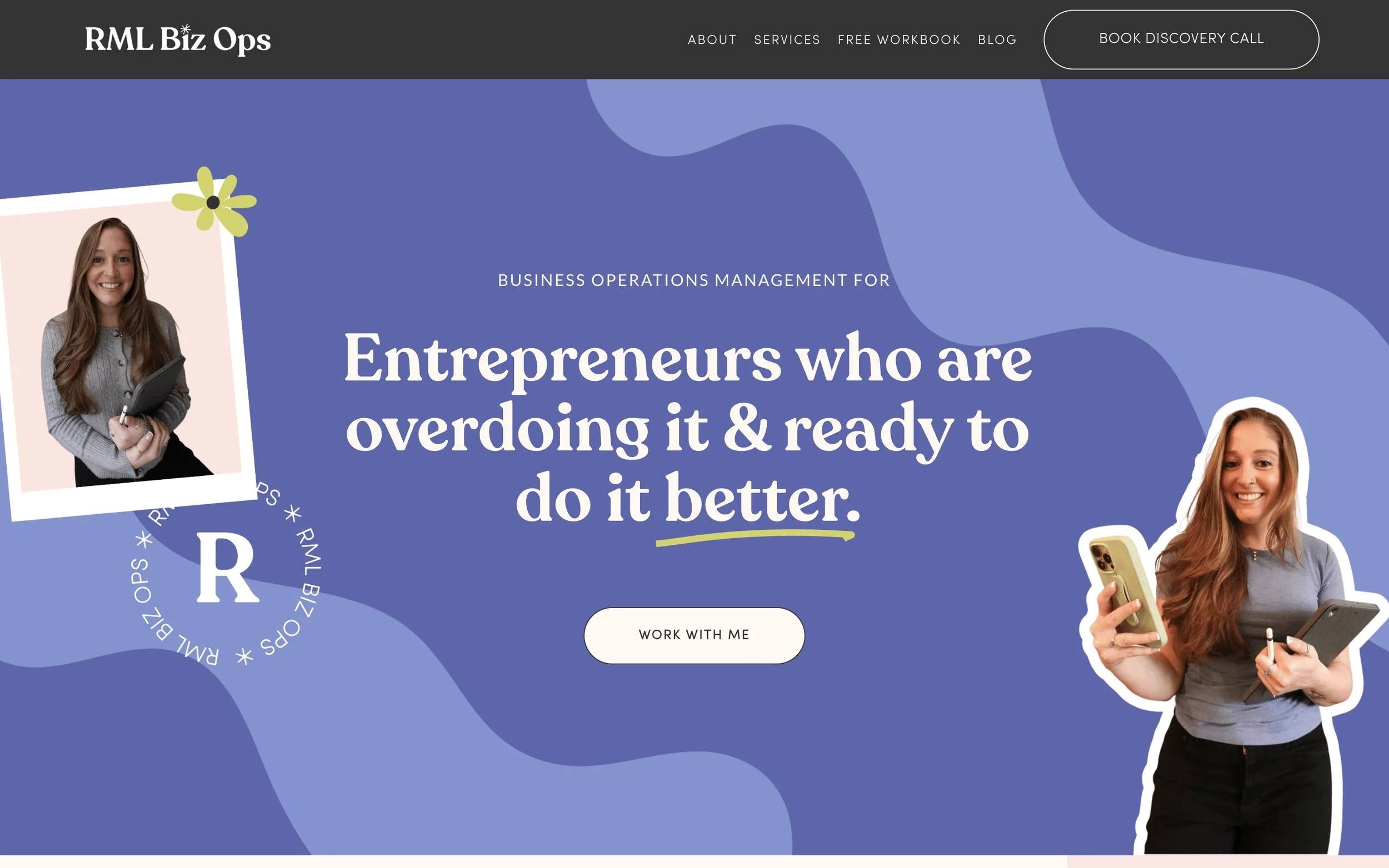
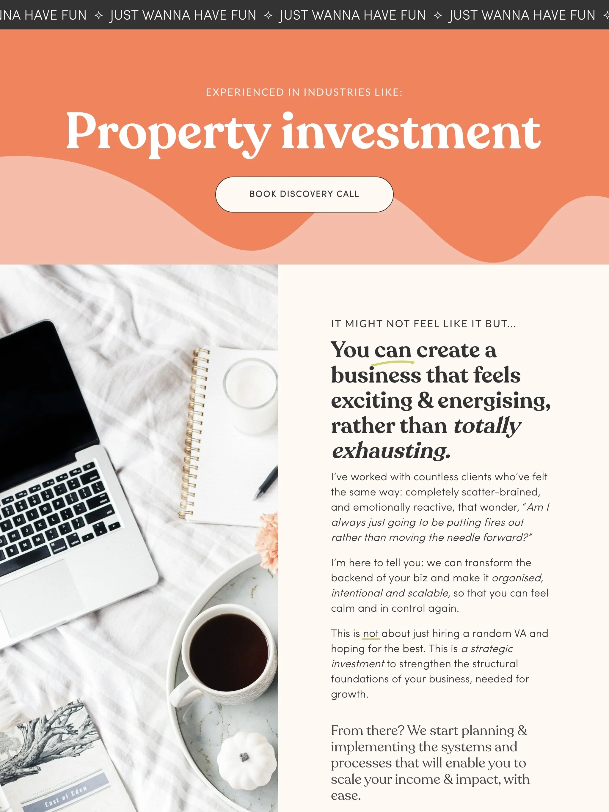
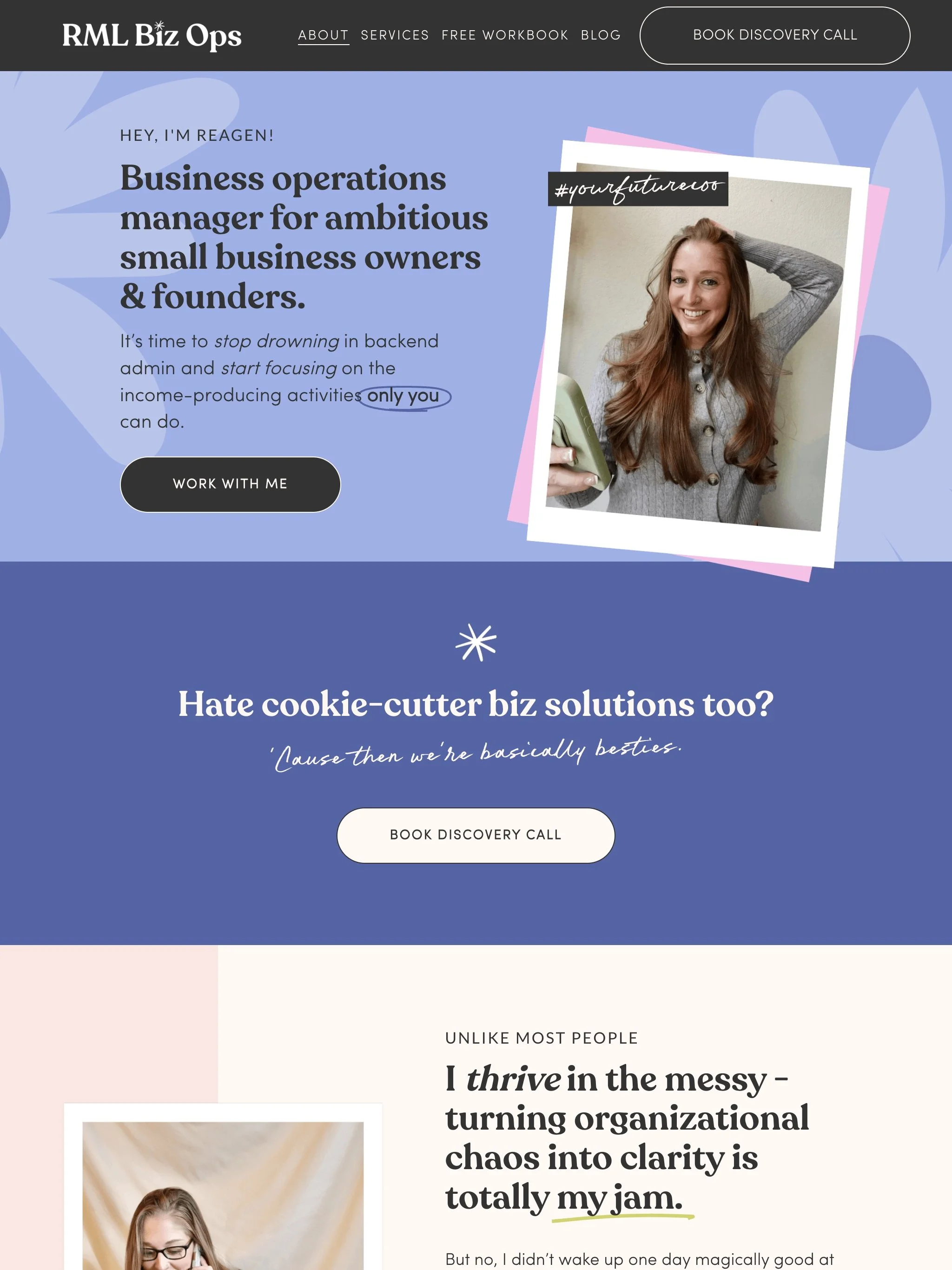
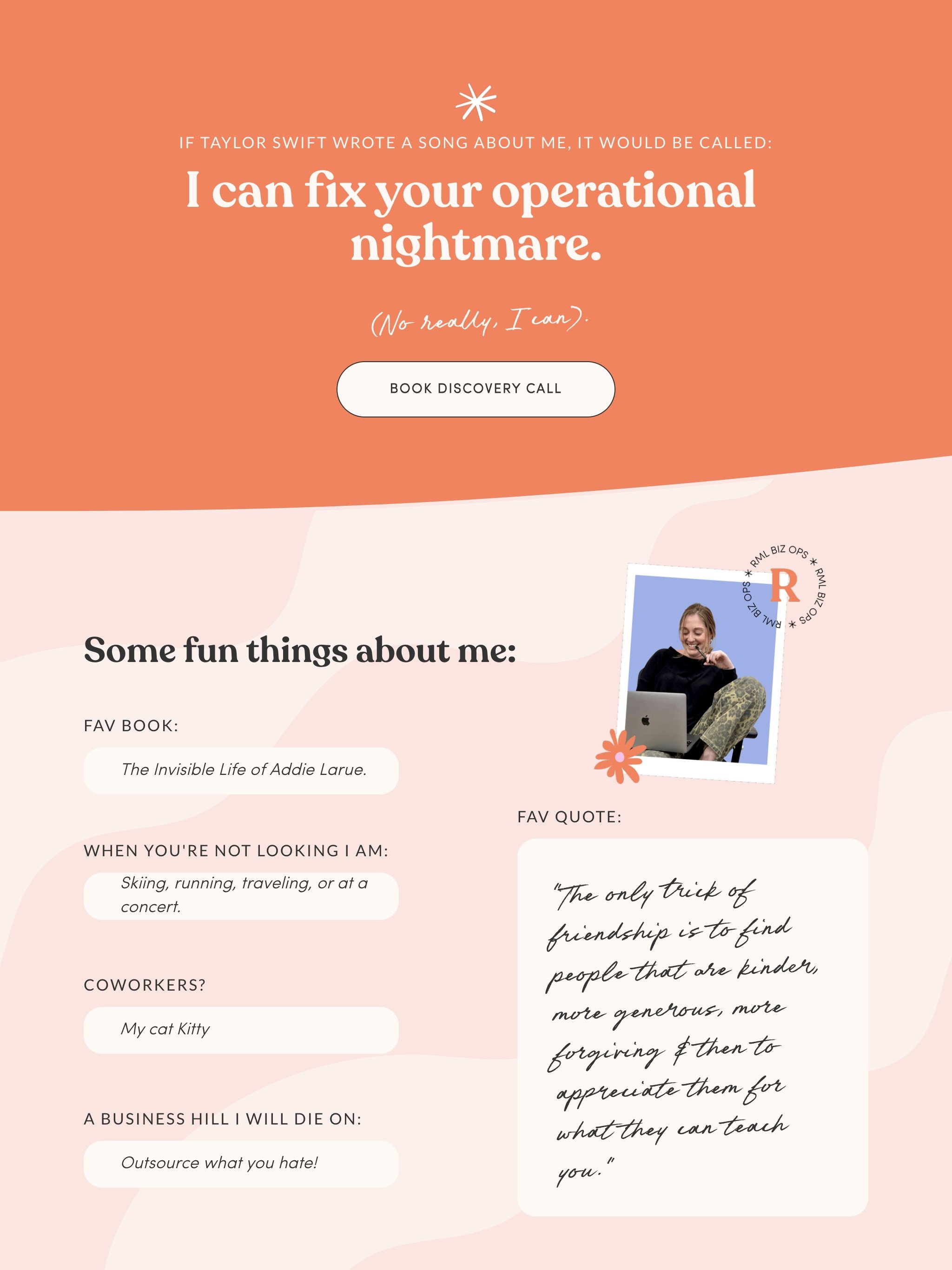
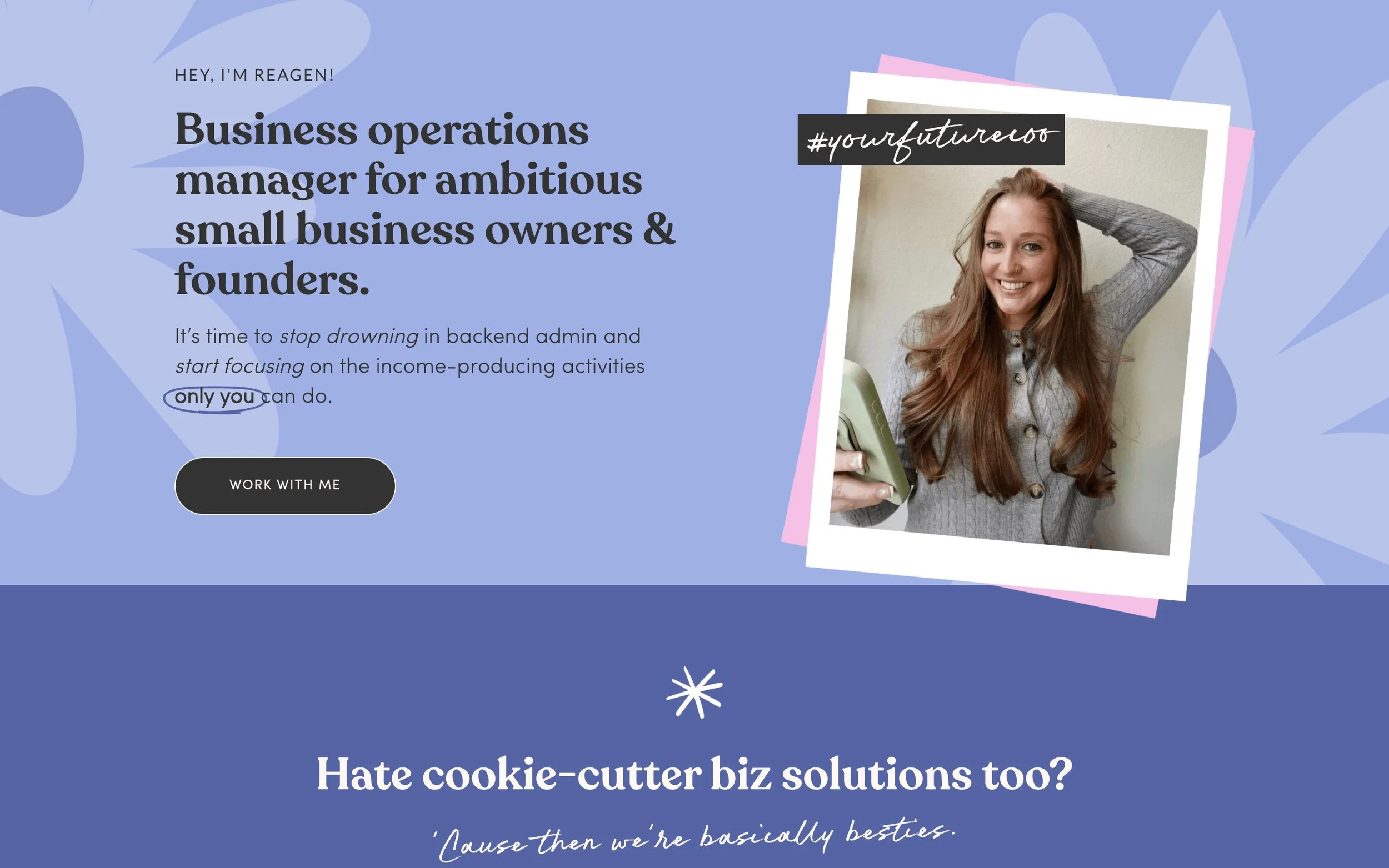
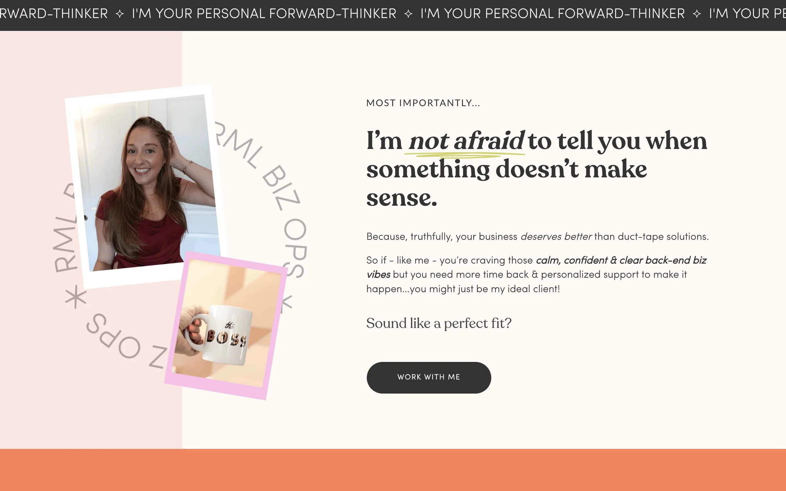
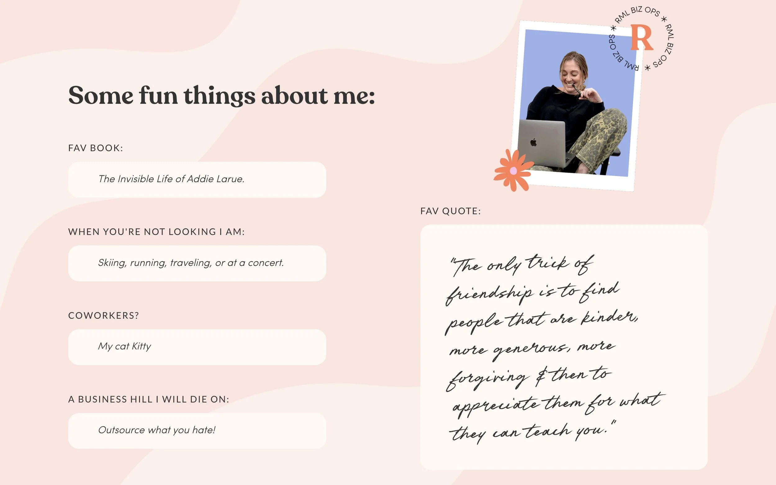
Bold & warm colour palette that communicates the excitement, motivation and genuine intentions behind Reagen’s brand.
An approachable serif font with curved edges paired with a handwritten script font that connotes attention to detail.
Wavy background graphics, colourful flowers and polaroid-like image frames that add a sense of fun & approachableness to the brand.

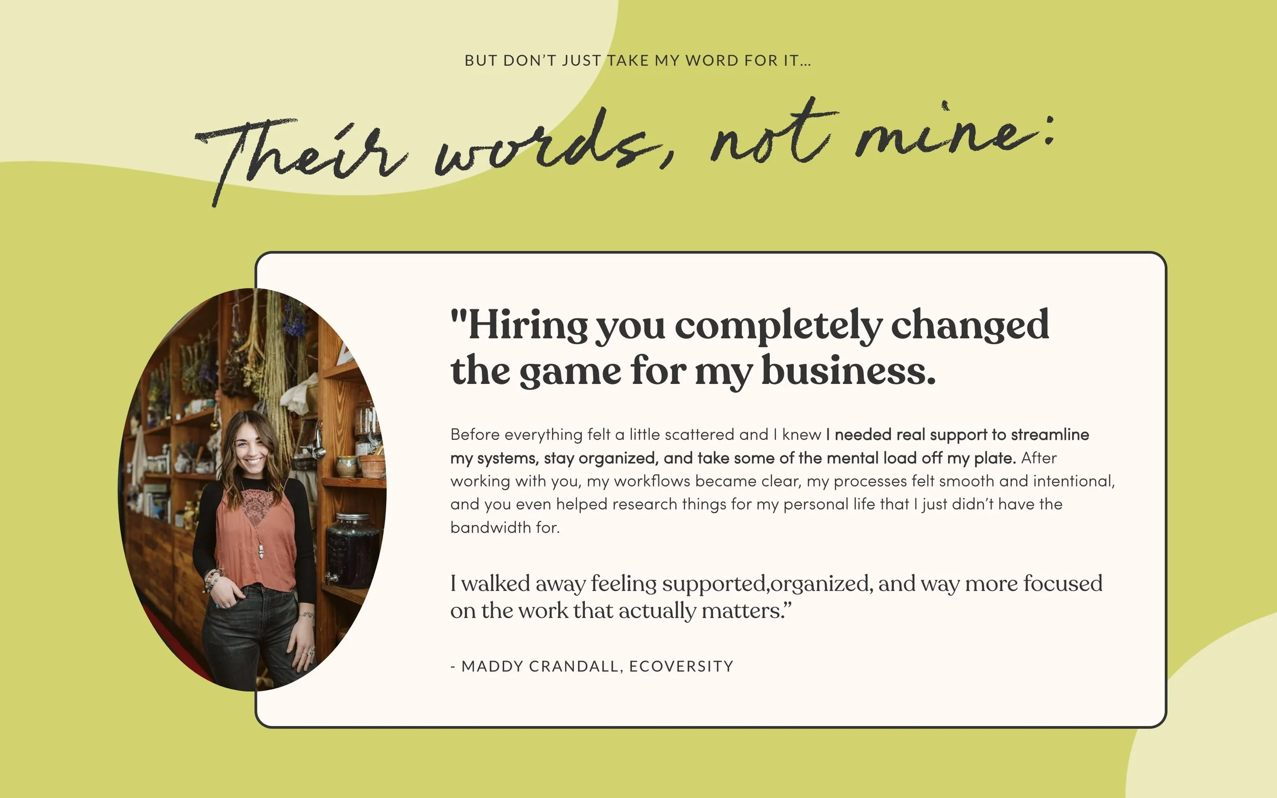
Copywriting:
An understandable struggle that Reagen had previously, was with writing copy for her website. She wanted words that would actually sell her services AND show off her personality, whilst still holding that professional edge. Fortunately, writing words that sell with personality is totally my jam!
I got started with some very important Voice of Customer research to nail down what kind of words her ideal clients actually use to describe the specific problems, fears, desires and objections they hold in relation to investing in Reagen’s services.
Then I wrote the drafts of the main pages of her website: the Homepage, About page and the Services page.
Reagen then had multiple opportunities to provide feedback and revisions on both the website copy and the design!
“Now my voice on my page sounds exactly like me, tells the story of all that i can do, and clearly maps out my services and skills. I was afraid to come off not professional enough, but with Kelly's copy writing, I sound like me, fun outgoing and honest while still being professional!”
-REAGEN, RML BIZ OPS
The After:
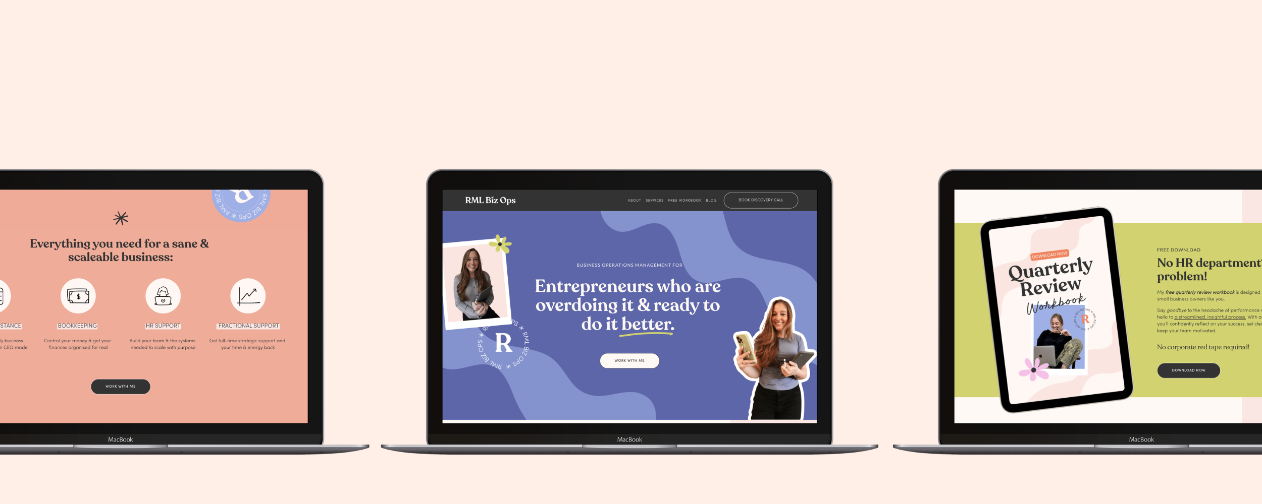
Now Reagen has a beautiful and effective Squarespace website that is totally profesh but also oozes personality - our favourite!
Her brand has had a complete overhaul with a new bold colour palette, fun fonts and graphics. The pages of her website are filled with strategic sales copy that effectively communicates the massive value of Reagen’s services, (without sounding boring & salesy.)
And each section has been designed with best-practice principles in mind to keep her viewer’s scrolling, clicking and booking!
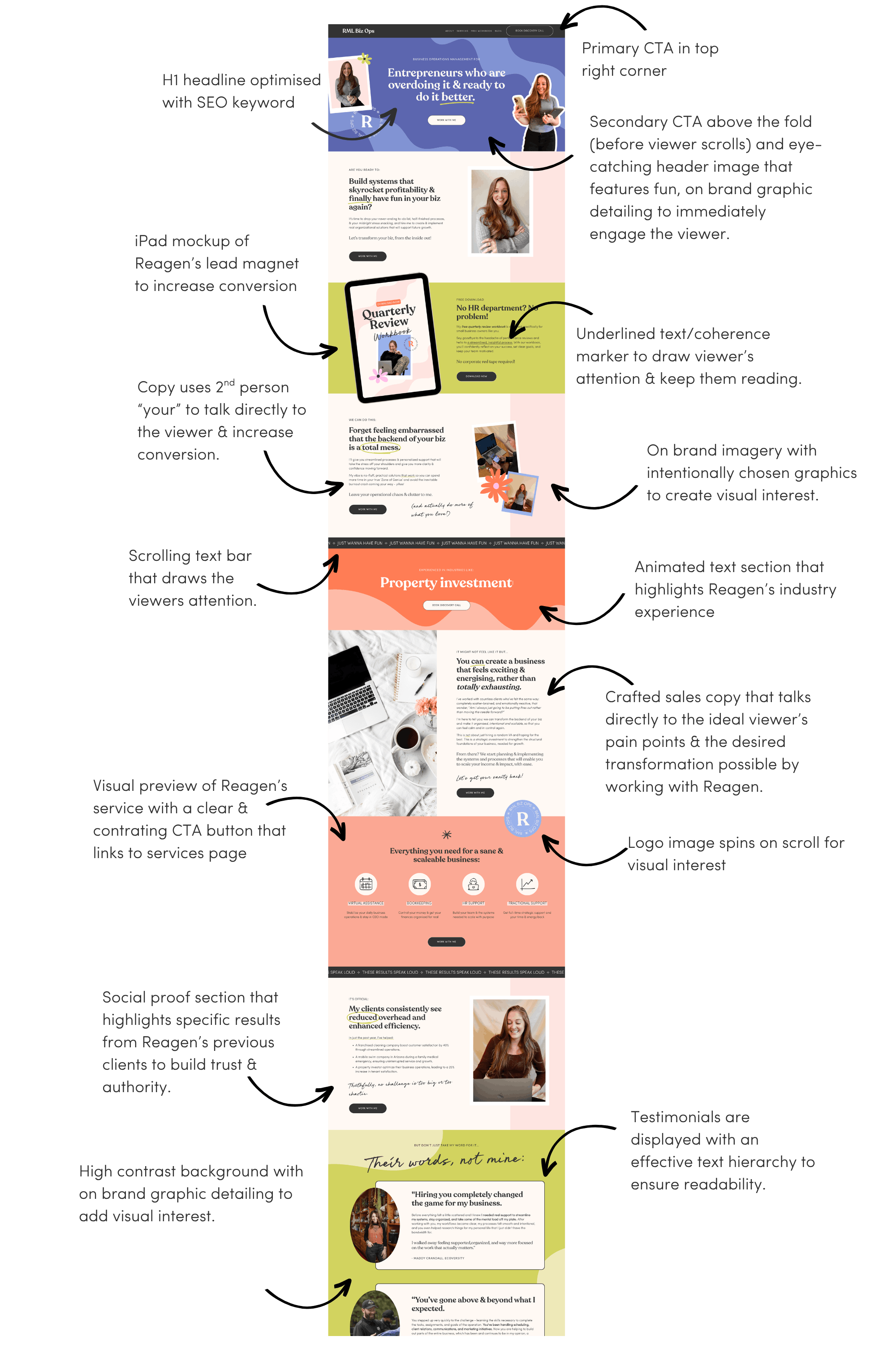
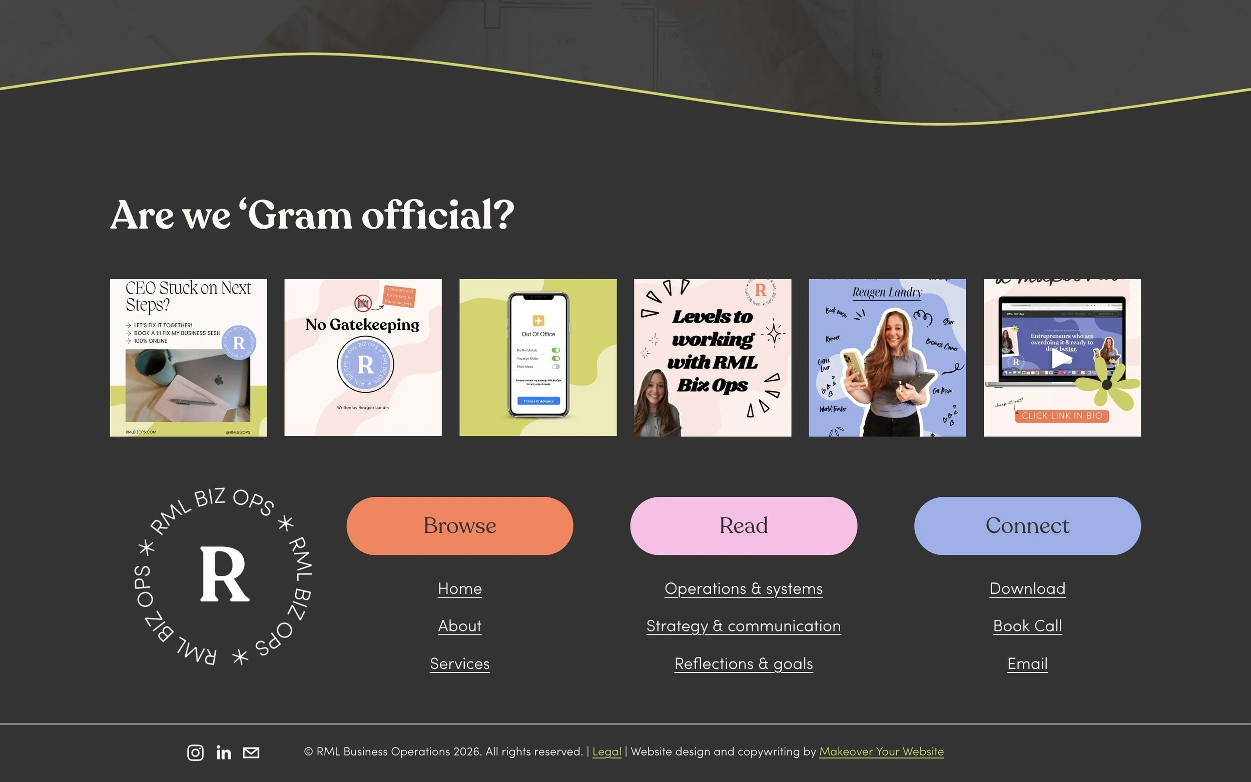
Web Design Elements
Take a closer look